Sometimes I think I might forget how I did something (and the best somethings are often the result of a happy accident) or, more often, I worry that the next bold stroke of the knife will wipe out the best bit of a painting. So I've got into the habit of taking quick photographs of the current work-in-progress in the studio when my hands are clean enough to operate a camera (in the field is different; there's more time pressure and, usually, fewer distractions).
This post contains a sequence of such photographs, with notes, for the painting of
Kimmeridge, which was painted on a clear-gessoed linen canvas with the six tube version of my standard palette: burnt umber, ultramarine, phthalo blue, lemon yellow, rose madder quiacridone. Most of the knife work was done with a Winsor and Newton no.27, with a smaller knife (Langnickel LP-1) used later on. I also used a silicone colour shaper for a few details and my signature.
I'm working from a photograph that I took in 2014. I hadn't seen the possibilities of the shot until now (except maybe in the instant that I took it). I remember the day. It was hot, very hot for England, the heat of the sun bouncing off the rocks. My husband and children were in and out of the sea but I felt unable, uncertain of my physicality, uncomfortable in the heat and unsure of my balance - and besides, I wanted to sketch. I made a very bad, overworked and tiny watercolour of the distant Clavell Tower. And I took lots of photographs.
This was one of them.
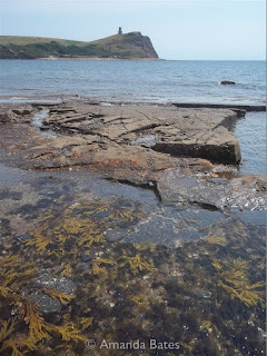 |
| You don't get to see my source photographs very often. |
Nearly three years later, I picked it out for the studio treatment. There was a lot of fiddly detail that would challenge the knife; of course, it wouldn't all go in, but if there was any chance of making the Clavell Tower recognisable in any way, I had to use a fairly large canvas. And I was trying not to think about the seaweed, but its colours anchored the image and justified the long format, so I would need to make them work... somehow.
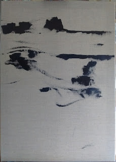 |
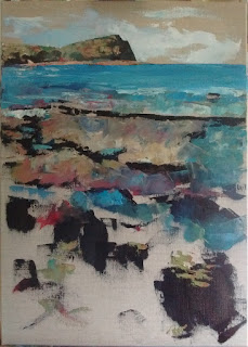
| Starting with the darkest areas, pure "dark": burnt umber and ultramaine - marking out the composition. This isn't all of the dark bits, but the position of the horizon and of the central band of rocks seemed, to me, to be important. I placed the top of the rocks quite deliberately at that "magic" 1/3 point that all the theory says is important (or is that "all the theory that I can remember"?) This image didn't need much sky. It was about the sea. And the rocks. Especially the rocks (and the way the sea shaped them). |
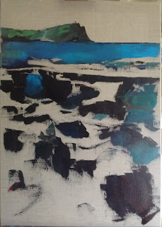 |
| Well, that's all of my initial darks added, with some colour on top (mainly blue). The lower right is where I imagine I'll be signing it and I try to remember to put a nice contrasty dark there in most paintings. But this isn't most paintings and I completely overlooked the fact that the foreground is all complex seaweed and shadow - too detailed for a swirly AJB right there. But it is quite shadowy in that corner, so that's fine. Hang on a minute - I also forgot to put the sky in! |
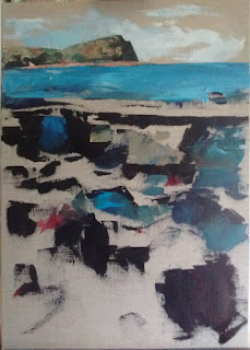 |
| Oh, thank goodness for that. There's the sky. And some pink bits. |
 |
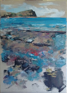
| Pink is a surprisingly important colour, Of course, it needs to be a good, strong pink, a blue-red colour - that can be used to tone down the most excessive of your greens, to make lively greys (see the sky), to create purples and oranges and reds. By this stage, I've employed the full paletted and I'm moving around the picture according to where the next bit of the colour on my knife should be. That colour changes as it picks up paint already on the canvas and I'm constantly reassessing, occasionally wiping the blade or, less often, scraping "wrong" paint off the canvas. The rocks are mostly blocked in, aong with the bluest bits of the sea (it's only now that I realise quite how much I have heightened the colour) and I've had a go at some of the seaweed. |
 |
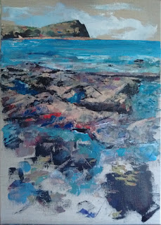
| That's most of the canvas covered. I'm leaving bits of the natural linen on purpose. What's the point of a clear gesso if you don't? The rocks are starting to look solid. That red stuff on the closest rock shelf is glorious. I exagerrate it. The seaweed is still a bit ... vague. |
 |
| I'm ignoring the seaweed. I'm having fun with the rocks. Edge of the knife, incising, finding the hidden dark, or, if that is lost, adding more dark, freshly made on the palette, as it slices through the softly yielding paint already on the canvas. I lose myself in the abstracted detail of the rocks. |
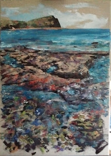 |
| The rocks are working; not quite complete, but I know what's happening
there. I've softened the dark shadows on the edges as they curve away
from the shadows I've established the main colours, the majority of the
cracks and lines. Let's have a go at that seaweed... More shadow. Greenish
bits. It's blotchy and crude and it looks alien to the rest of the
image. |
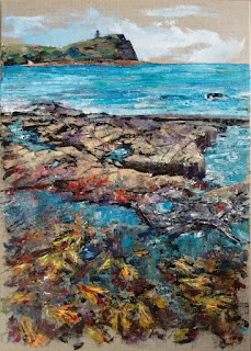 |
| I distract myself with the fiddly details of the tower. It's a distinctive shape, and the appropriate proprtions elude me for a while. The back down to the seaweed... Suddenly, I realise that it's too green. It's a bit green, but there is far more yellow and red - even some white to lighten beyond the powers of the lemon yellow. And the shadows are less blue than I had them originally. The foreground paint layers up, gets scraped back here and there... How do I make it look wet and under-watery? Reflections, ripples, white, nearly white, a few dark, incised with the silicon colour shaper, with the knife (a finer, subtler line, harder to curve). And finally, carefully, dragging a near-white mix gently down over the surface, barely shifting it, distorting a little, smoothing its paleness into the colours already there... Done. Signed. Complete. |


No comments:
Post a Comment
Tell me what you think!