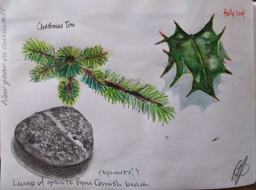
Thursday 29 January 2015

New Sketch Blog


I have recently started up a new blog, one that is dedicated to sketches, sketching and sketchbooks. You'll find a link to it on the front page of my Web site, or you could go straight there:

.    http://sketch.amandabatesart.co.uk/

While the new blog is based largely on my own experiences and work, I am hoping to rope a few other artists in at some stage. I'm also intending to link out to interesting and relevant sites.

Monday 26 January 2015

Burns Night Flowers

Sepia acrylic ink and watercolour (violet, yellow ochre and Hooker's green)

Portsmouth

Today was spent in Portsmouth; with the two paintings duly delivered to the Guildhall (see them in the basement from the 28th January), we couldn't resist wandering down to the seafront to sketch...


Sunday 25 January 2015

#C2C15: Spots in Time

spots500
Spots of Time
Who, me, literal?

The most recent Cover 2 Cover sketchbook was a challenging one. "Spots in Time" refers to a Wordsworth poem, and the brief was to investigate transience and the passage of time, with reference to personal memories and the natural world.

So I decided, reluctantly, to leave science fiction and time travel out of it.

The next exchange is a week tomorrow. I wonder what theme I'll get ...


dayfuturechanged-500
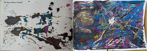
The Day the Future Changed
It did. And that's all that I'm saying.
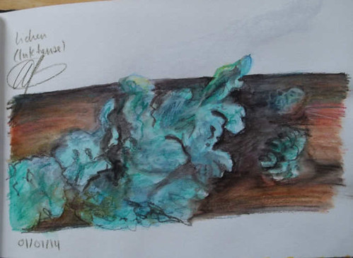
My only double page spread in this book.
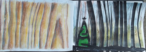
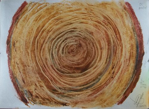
4-treerings500 
Tree Rings
Because they represent a succession of moments in time
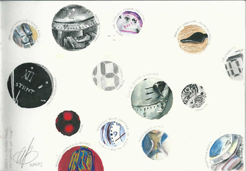
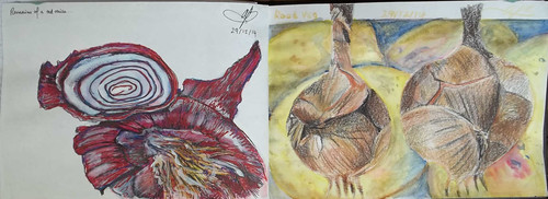
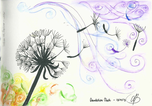
dandy500
Dandelion Clock

6-guitar500
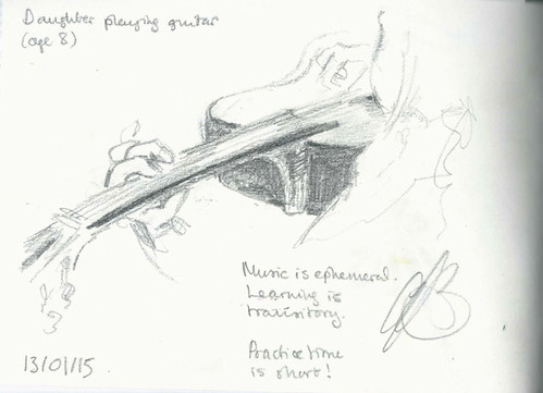
Music, learning and practice

7-grand500 
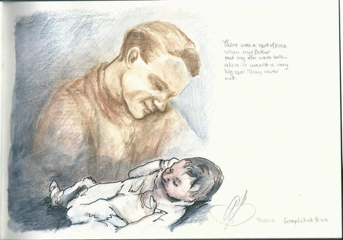
A moment that never was 

8-wonkyK1000-500
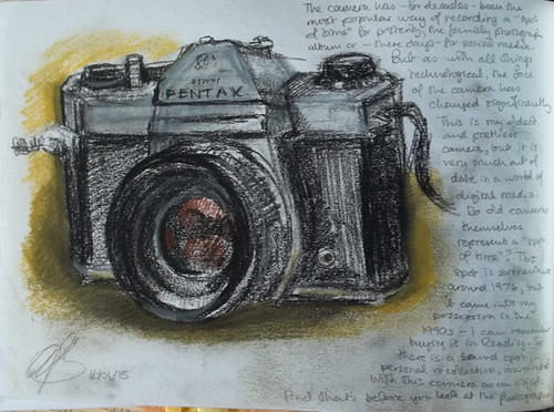
A way to capture those spots of time

9-MissH500
Reference to Great Expectations and bad housekeeping

10-waves-500 
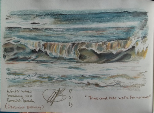
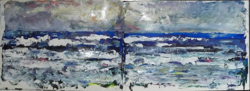
"Time and Tide" doesn't really refer to waves, but it's a nice saying and the picture does represent a spot of time. A spot spent watching the waves at Portreath... mesmerising.

I'm really annoyed that I put an 's' in 'waits'. 

"Here and There" in Portsmouth

There is an arts organisation in Portsmouth called aspex, of which I am an artist associate member. The inaugral associate exhibition is  called Here and There and is to be held at two sites in the city; at the Aspex gallery on Gunwharf Quay and at the Guildhall. I submitted four works and two were selected for the Guildhall; whether by coincidence or design, they do, indeed, represent a here (Hampshire) and a there (Cornwall).

Here (Hampshire) ... and there (Cornwall)
Kingsclere Downs and Sunsetting (Over Penlee Point)
Framed and sitting on a picture shelf in my studio.
I'm taking my paintings down next week, and the show will be on from the 28th January to the 14 March.


Wednesday 21 January 2015

Slide

It's an abstract. It means everything or nothing.

I called it 'Slide' because of the curve; I added the curve to break up the perpendicularity of the lines ...

Oil on canvas, 30 x 40 cm

Backlight (poppy)


This is based on one of my many source photographs of poppies. I had thought that I might not use this image, but it struck me yesterday that the way the sun shone through the petals was rather starkly primary - almost primal. I did most of the colour-mixing, such as it is, on the canvas, which is naturally coloured linen.

Backlight
Oil on canvas, 30 x 40 cm

Monday 19 January 2015

Dippies

Little dip pen
Indian ink, drawn with the subject

I do quite a lot of ink sketches out and about with a Rotring Artpen (a cartridge pen), but dip pens (or "dippies" as I've started calling them) are not as practical; you need an open bottle of ink to hand, and in the conditions that I often sketch (standing in a wood or a field or on a footpath), I just don't have enough hands! 

But dip pens do have their advantages. They can cope with far more ink types than any fountain or cartridge pen (the Rotring uses a modified Indian Ink that is less shiny and more watersoluble - full-on Indian ink, which is made from lamp-black, would clog the Artpen). They also have the potential to be more flexible. And greater flexibility, in a pen, means greater variation in line width (this is because a bendy pen's tines will move further apart under less pressure, and release a wider ink line). Which can permit some truly beautiful marks to be made. 

I'm not saying that all of these marks are beautiful, but there are a few rather nice ones... 

Little apples
Quink (black and red) and water

Little Meerkat
Quink
Left: is simples; right: is wet

Saturday 17 January 2015

Diagonal Poppies

Diagonal Poppies
Oil on canvas, 80 x 80 cm,  commission
I've called this Diagonal Poppies because of the composition (the flower heads rise diagonally into the sky as you go from left to right), although it also, effectively, "Cottington's Poppies 5". The image, though it represents a very specific place, is a composite of several source images, and I wanted to make sure that it was a strong image (hence the geometric design) that was distinct from previous treatments of the same subject.

Here are the "in-progress" shots:


The hill in the background is Cottington's Hill, upon which sits our local radio mast, Hannington Mast. The mast is, unsurprisingly, a local landmark, and its inclusion was requested by my client. The daisies were also specified, and are based on the chamomile found in the field from which the view is taken.


Tuesday 13 January 2015

#C2C15 Textures and Shapes in Nature

Monday was the Cover to Cover sketchbook exchange day, and here are my contributions to "Textures and Shapes in Nature":

1-grainscape-&-2-treescape-500 3&4seascape-badphoto 5&6-rootvegspread500
7-christmas&newyear500 8-bluelichen500 
9&10-lichen500

My new theme is "Spots of Time" and is well underway...