Showing posts with label Sketchbook. Show all posts

Sunday, 5 February 2017

Cover 2 Cover 2017

The local Open Studios sketchbook exchange scheme is well underway and I don't seem to have posted about it at all. This year, we are working in second hand books, chosen to refect our themes. It's a strange feeling, delibeately defacing a printed book, but it's easier if you're not the first...

Here is a small selection from the work I have done so far.

My own theme was Classical Mechanics, which is about macroscopic movement and physical forces. The book I was given was A Child's A-Z of Technology, whose slippery A4 pages were difficult to work with; I ended up obliterating much of the content with acrylic gesso, although there were a few entries that seemed apt enough to retain:
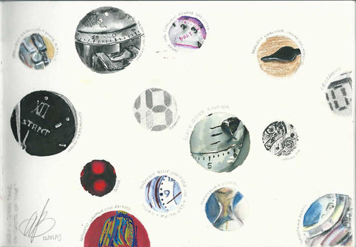
Clocks and Cogs: original content, graphite pencil, Molotow marker and watch parts.

Sunday, 12 June 2016

St Leonard's in Oakley

It was raining, so I sat under the lych gate to make this sketch.

Curious about the unusual name of this church (many a church is named for saintly Peters, Pauls, and Marys - although I'm not aware of any dedicated to Puff the Magic Dragon), I discovered that Leonard was a sixth century frenchman known for freeing prisoners.

Given the dedication, I was assuming that I would find a definite assertion that the church building was (underneath all the additions and alterations) of Norman origin, but there seems to be no such statement to be found online. It is, however, believed that a Norman chuch stood on the same site.

The history of the building seems vague until the 16th Century, so it seems reasonable to state that the church is medieval with distinctive Victorian additions. It is, however, charmingly quirky.

Friday, 22 January 2016

Sketchbook Exchange 2016 (part 4: Smooth)

I was delighted that a friend was able to fix the nib of this pen. It now writes (and draws) smoothly...

Acrylics applied with a knife. Smooth blades to keep Judge Dredd's chin stubble-free...

Banana from life.
Blender from Leeds (via a sketch I made on a weekend visit to my friend there)
Rest of the fruit from memory.
Glass of smoothie from imagination.

All drawn in Molotow markers, with indigo-fountain-pen-ink curvy lines

Friday, 11 December 2015

Sketchbook Exchange 2016 (part 2)

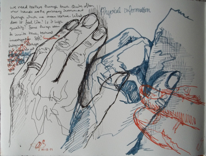
This was a tricky one. The theme is still texture; the sub-theme is meaning.

I started off by thinking about how we read texture - primarily through our hands.
So I drew my hands. Note that it's mostly my left hand...

This was the last page that I drew, but the second page in sequence.
It occurred to me that texture is often used in simile,
so I had a bit of fun with some common phrases.

My husband suggested this one to me. Sometime during my lifetime (and his), these textured paving slabs have started to appear on the footpaths. There are ridged ones (whose main purpose seems to be to redirect the wheel of your road bike; quite why they are used on cycle paths I do not know), and there are these bumpy ones (the bumps are "truncated domes") that indicate the best place to cross the road; the texture, of course, is primarily intended for people with impaired sight.
This image is based on a crossing place close to my home. I used heavy body white acrylic to give the page some bumps (not very convincing truncated domes) and drew over the textured page with Molotow marker pens and Uniballs, including some explanatory text.  

The last of my pages in this book is an extension of the "tactile paving" idea.
This time, one hope that the primary users of the textured surface are able to see, because it is a road and the cobbled rumble strip / road hump / sleeping policeman is supposed to be for the benefit of the motorist. The macro-texture is intended to be felt through the vehicles wheels and should encourage the driver to slow down. Again, I used heavy body acrylic for the texture - spreading it thickly to make the road hump and incising it with the knife. There's a cheeky hint of a song drawing that refers to the 59th Street Bridge Song. "Slow down, you're going too fast... "

Tuesday, 10 November 2015

Sketchbook Exchange 2016 (part 1)

Artists from West Berkshire and North Hampshire Open Studios have started their 2016 sketchbook project. This time, we made our own sketchbooks, concertina-style.

I wasn't enamoured of the floppy card cover. Having been assigned the theme/subtheme Textures/Grain, I decided to use some things with grain to replace the card...
3mm beech-faced plywood, carved, with leather. Held together with nuts and bolts from an I-can't-believe-it's-not-Meccano toy and annotated with Molotow marker pens
There are only four pages per artist in these books, so I crammed several grainy things onto my first page:
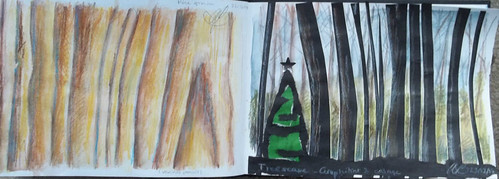
Pine grain (Derwent Drawing), grains of rice and salt (Molotow), wheat (pen and ink, acrylic); sand (Molotow)
(It being a concertina, I thought I'd use the back of another page and put some grains there, to be seen through the knot holes. There are a few that can't be seen easily, too).

... and the next page was also home to several thoughts:

Wooden handle of hand chisel (Molotow), alabaster grain (watercolour and watercolour pencil); pointillist landscape, imaginary (Molotow)
But the last two pages were home to one idea. A fairly off-topic idea, inspired by the "grain" more than by the the "texture".
John Barleycorn, folk song, as sung by Traffic. Molotow and acrylic inks
It's a song drawing. They started in last year's sketchbook exchange project, and they've come back in this year's.

Thursday, 16 April 2015

Hove, Roofs


Yesterday, I went to Brighton with my children. But I parked in Hove (actually), as part of a plan that was largely scuppered by a derailment outside Brighton station.

This is the view from the top of the multistorey car park in Hove.

Lanuishing in Langrish

Langrish (sepia ink)
My car broke down on the A272 yesterday. It developed a coolant leak...

Wednesday, 11 February 2015

#C2C15: Yin and Yang in the Garden and Countryside

https://www.flickr.com/photos/zalamanda/sets/72157650267591569/
Click to see the set on Flickr
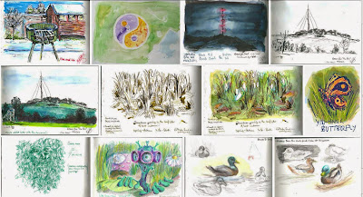
The sketchbook exchange programme continues, with two more swops left to go.  This one was a challenge; finding complementary opposites in the greener outdoor space. I admit that I made one or two up... 

Page 1 was based on our garden. It was the one day that we have had snow this winter, and the suggestion was my husband's: a barbeque in the snow, representing fire and ice.

Page 2 was a stylised flower bed in a park, viewed from above, rendered in watercolour with the assistance of my new masking fluid. The flowers are laid out in the shape of the yin-yang symbol. There's a picnic happening in the blue corner...

Pages 3 and 4 are linked; they represent night and day, with the local radio mast (and landmark) shown from two positions. The daytime view was drawn outdoors and the line drawing made onsite is shown separately from the finished version. These are both done in various inks.

I also included, in the Flickr set, the line drawing for the snowdrop picture on page 5, embellished with watercolour for the finished image. Snowdrops growing in last year's leaf-litter.

A digital doodle of an imaginary yin-yang butterfly had to be printed and stuck in on page 6.

Two green men face each other on pages 7 and 8. Both are imagined versions of familiar tales; the age-old folk storie of the wood spirit and the newer invader from out of space. Old and new; within and without; earthly and alien.

Finally, I went back to nature on pages 9 and 10 and drew the mallards on Kingsclere's lake. Easily distinguished, the male and female birds are a fine example of yin and yang.

Monday, 26 January 2015

Portsmouth

Today was spent in Portsmouth; with the two paintings duly delivered to the Guildhall (see them in the basement from the 28th January), we couldn't resist wandering down to the seafront to sketch...


Sunday, 25 January 2015

#C2C15: Spots in Time

spots500
Spots of Time
Who, me, literal?

The most recent Cover 2 Cover sketchbook was a challenging one. "Spots in Time" refers to a Wordsworth poem, and the brief was to investigate transience and the passage of time, with reference to personal memories and the natural world.

So I decided, reluctantly, to leave science fiction and time travel out of it.

The next exchange is a week tomorrow. I wonder what theme I'll get ...


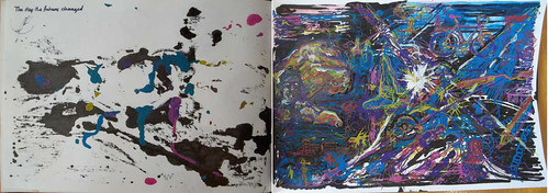
dayfuturechanged-500
The Day the Future Changed
It did. And that's all that I'm saying.
My only double page spread in this book.

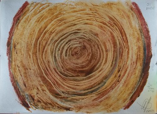
4-treerings500 
Tree Rings
Because they represent a succession of moments in time

dandy500
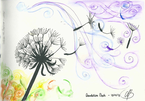
Dandelion Clock

6-guitar500
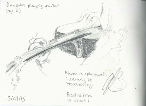
Music, learning and practice

7-grand500 
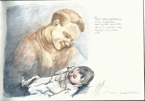
A moment that never was 

8-wonkyK1000-500
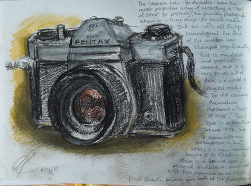
A way to capture those spots of time

9-MissH500
Reference to Great Expectations and bad housekeeping

10-waves-500 
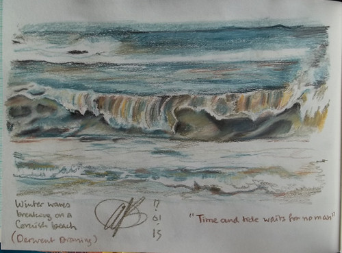
"Time and Tide" doesn't really refer to waves, but it's a nice saying and the picture does represent a spot of time. A spot spent watching the waves at Portreath... mesmerising.

I'm really annoyed that I put an 's' in 'waits'. 

Tuesday, 13 January 2015

#C2C15 Textures and Shapes in Nature

Monday was the Cover to Cover sketchbook exchange day, and here are my contributions to "Textures and Shapes in Nature":

1-grainscape-&-2-treescape-500 3&4seascape-badphoto 5&6-rootvegspread500
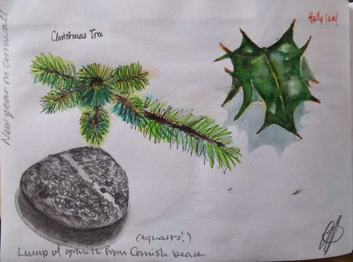
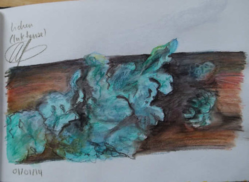
7-christmas&newyear500 8-bluelichen500 
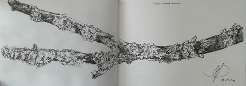
9&10-lichen500

My new theme is "Spots of Time" and is well underway...

Sunday, 7 December 2014

#C2C15 Seeing and Not Seeing

I have somehow completed the third sketchbook theme early. This is "Seeing and not Seeing".
All five of my double page spreads are in the box below; click left or right to move through them:


The images are:

Big Yellow Taxi (double page)

Because, "Don't it always seem to go / That you don't know what you got 'til it's gone."
Acrylic and Derwent Drawing Pencil.

Interference and Spectacles

The former is a physics experiment that demonstrates how light waves interact (reinforcing and negating each other); and the latter make all the difference between seeing and not seeing if you're short-sighted.
Graphite and acrylic; Derwent Drawing Pencil.

Eyes (double page)

I am more shortsighted in the left eye; this is, of course, a mirror image. I portrayed the left eye without glasses and with an excess of water. The idea was to create a blurry image; the dribbles were a bonus. I was more measured in my treatment of the bespectacled right eye.
Watercolour.

Schrödinger 's Iron Man (double page)

Science meets art with bonus Black Sabbath. Schrödinger's cat is a thought experiment that uses observation to "fix" a previously indeterminate state (is the cat alive or dead?). The atom just happens to be Lithium (added Nirvana?).
Mixed media.

Painty Water (double page)

I see therefore I paint (and draw). The murky water in the jar obscures and distorts the paintbrush(es) and, in the final view, the lettering on the place mat.
Various media - exploring the utility of different media to illustrate the murk.

Wednesday, 3 December 2014

Cover 2 Cover / Trolls

The lady who initiated this theme has an interest in Scandinavian folklore, and her trolls were all dignified, forest dwelling creatures.

Mine are a hotch-potch. Here they are with descriptions.

Friday, 28 November 2014

Bonus Troll

Still Life Painting in Acrylic of Russ Troll Doll

I borrowed a few of these "Troll dolls" (AKA "Dam dolls," after their creator) from a neighbour for the next part of the Cover 2 Cover Sketchbook project. Two of the dolls made it into the sketchbook; this one is a small surprise gift for my neighbour.

Postscript: You'll find the Sketchbook trolls on Flickr. They'll get blogged when the final spread is done...

Acrylic on canvas, 5 x 7"

Monday, 24 November 2014

Cover 2 Cover / In the Clouds / Pages 8 - 10

The final pages of my bit of "In the Clouds". And a drawing on the cover...

Sunday, 23 November 2014

Cover 2 Cover / In the clouds / Pages 5 to 7

Continuing the trawl through my part of my collaborative sketchbook, themed "In the Clouds". The music links are a little less direct this time, but I thought it would be fun to think of a popular song or two to go with each picture.

Saturday, 22 November 2014

Cover 2 Cover / In the Clouds / pages 1 to 4

These sketches weren't done in the order that they appear; I had several ideas right from the start and I wanted them to appear in certain combinations. I also wanted to vary the interpretation of the theme and the media used, and to try and challenge myself a little. As a result, I managed to learn one or two things.

Page 1

"Cloudbusting", oil on paper.


This is an imaginative piece, with a cloud-dancer and a couple of Kate Bush songs (Cloudbusting and The Big Sky) in mind.
It isn't painted on the page of the sketchbook, but on a small piece of oil-painting paper. I started with the idea of using "lean" paint (thinned with turpentine) but ended up with fatter-than-fat neat titanium white, trowelled on with a knife. Needless to say, it's still too wet to stick in the book. Fortunately, I get the book back at the end. 
Update (24/11/14): It seems to be dry enough, so I stuck it in the book this morning. 
Something learnt: No more palette-knife oils in the sketchbooks!

Page 2

"Nuthanger Down in the Mist", Graphitint.


A Down-to-earth cloud, with trees in it... Based on a photograph, this subject seemed a good match for the subtle colours of Graphitint.
Something learnt: White Graphitint has its uses.


Page 3

"Head in the Clouds - Daydreaming" (self-portrait), oil pastel (Sennelier Nature set).

 A metaphorical interpretation. Oil pastel is great fun to use, allowing broad strokes and fine scratching-back (it can also be dissolved in turpentine, but I didn't do that here). It's not best-suited for small drawings; I think I was pushing the limit here. It also never dries, and remains malleable for - as far as I can tell - ever. Oops.
As I had a drawing opposing it in the sketchbook, I needed to do something about that. I cut a piece of greaseproof paper roughly to size and sellotaped it in as a protective leaf. This worked until I foolishly went and stood in a field on a windy day to make the last sketch, at which point the sketchbook flapped around, the greaseproof paper rolled and folded and ... no damage was actually done. But it could have been, and the sketchbook is only at the beginning of its journey, so I investigated online and discovered that Sennelier make a fixative for oil pastel based on a resin spray. It arrived yesterday and seems to do the job very well.
Something learnt: Greaseproof paper is a clumsy solution to the problem of oil pastel in crowded sketchbooks.

Page 4

Ice Cream Castles In the Air, Indian Ink (Derwent Graphik Line Maker pens)


A daydream, a fantasy, and a line from the Joni Mitchell song Both Sides Now, which also happens to be (in part) about clouds. A friend told me it reminded her of Gormenghast, and she is right, although it was unconscious on my part. (I really must read the whole trilogy.)
Something learnt: Don't draw legs on distant flying dragons*.

--------
*I ended up painting the legs out. It looks messy.
--------

More castles in the next instalment...

Friday, 23 May 2014

Four-Pastel Sketches

It rained for most of today, but the evening was delightful. My generous husband suggested I get out on the hills for an hour or so after tea; how could I refuse?

Tuesday, 10 September 2013

Dipping into Watercolour Sketching

Above: Tadley Common, with and without cattle. Both ~ 20 minute lunchtime sketches.
Below: 15 minute sketch of fields near Kingsclere.

Watercolour is a dashed tricky medium.