Showing posts with label Oil painting. Show all posts

Thursday, 27 September 2018

Cannon Heath Down revisited

The Vale of Kingsclere, oil on canvas, 60 x 30 cm
I have been neglecting this blog recently in favour of building an all-new Web site on another platform. This site will remain as an archive.

However, it only seemed right to post today's work here.

Saturday, 14 July 2018

Henge

Henge, oil on canvas, 50 x 50 cm
What is a henge? In short, it is a prehistoric ring bank and ditch, with the ditch on the inside. The word is a backformation from Stonehenge - which doesn't actually have a henge! It's all a bit confusing, but what is certain is that the large earthwork that encircles Avebury (village and stone circles) is called a henge.

Saturday, 2 June 2018

Prussia Cove cliffs

Prussia Cove Cliffs, oil on linen canvas, 46 x 55 cm
Prussia Cove is a secluded part of the south Cornish coast, with a turbulent history of wrecking and smuggling. Now, however, it is known for its natural beauty and an International Music Seminar. When the tide is in, the beach is all rocks, pebbles and rock pools. Here I have focussed on the cliffs, which had some reddish vegetation clinging to them. I don't know what it was, but I do like the extra colour, which drew my attention away from the sea back towards the land.

Prussia Cove Cliffs
oil on linen canvas, 46 x 55 cm
£360

Friday, 1 June 2018

Blue and Gold

Blue and Gold, oil on canvas 46 x 55 cm
A reprise, of sorts, of 2016's Gold and Grey, this is a view from a local footpath. These distinctive trees are visible for miles around and are a welcome landmark as well as a favourite subject.

Blue and Gold
oil on canvas, 46 x 55 cm
£340

Tuesday, 29 May 2018

Red Wine and Apricots: a series of three oil paintings

These three paintings were made on Saturday, Sunday and Bank Holiday Monday of the long weekend just gone. I had my studio open as part of Open Studios West Berkshire and North Hampshire on all three days, and it seemed like a useful sort of thing to be doing in between visitors.

I was attracted to the glassy reflections and to the subtly varying colours of the bottle and its dark contents. I also enjoyed the contrast with the duller texture of the apricots and the book, which toned so seredipitously with the fruit.

Each painting is 33 x 41 cm and is executed on clear-gessoed natural linen in oil paint with a knife (more accurately, a selection of knives). Together, they tell a sort of story - a very ordinary story, of things being consumed - but they aren't necessarily intended to be a set. Despite that, I can't help but think of them as being the beginning, middle and end...

Read Wine and Apricots 1 (Beginning), oil on linen, 33 x 41 cm, £140

Red Wine and Apricots 2 (Middle), oil on linen, 33 x 41 cm, £140

Red Wine and Apricots (End), oil on linen, 33 x 41 cm, £140
Just in case you were wondering, the wine was a smooth but unremarkable Bordeaux, the book is Leonardo by Martin Kemp, and the apricots were - well, they were apricots, and they were very nice.

Monday, 21 May 2018

Sentinel: Danebury Hillfort

Sentinel, oil on linen, 70 x 50 cm
I've painted this beech tree before, but this time it is in leaf, and more of the lumps and bumps of the hillfort's earthworks are visible.

The tree stands, tall, proud and solitary, by the entrance to the fort (here, we are looking out of the fort). It made me think of a guardian or sentinel.

Sentinel
oil on linen, 70 x 50 cm
£260
Painted 19 May 2018 in Open Studio

Thursday, 17 May 2018

Embankment: Beech Wood at Danebury Hill

Embankment: Beech Wood at Danebury Hill, oil on canvas, 40x50cm

Earlier this week, I visited Danebury Hill, where there is a large, well preserved, iron-age hill fort. There is also a very lovely beech wood on the side of the hill. Here, the beech trees are growing over the outer ramparts of the fort, their shallow root systems rising from the ground as the trees cling to the earthworks.

The painting is based on photographs that I took at Danebury.

Embankment: Beech Wood at Danebury Hill
oil on canvas, 40 x 50 cm
£210


Wednesday, 16 May 2018

Blue Twist (Wolverton Blue 3)

Blue Twist (Wolverton Blue 3), oil on linen, 46 x 38 cm
Last Friday, I revisited Wolverton Woods to catch the end of the bluebells. I was attracted by the fantastic contortions of the large beech tree that became the focus of this painting.


Blue Twist
oil on canvas, 46 x 38 cm
£160

Friday, 20 April 2018

Devil's Den, or, The Resting Place - SOLD

Devil's Den, oil on linen canvas, 46 x 38 cm
The Devil's Den is a reconstructed (c. 1921) dolmen (neolithic) near Marlborough in Wiltshire. As far as I can tell, it is the closest such monument to where I live (there seems to be a shortage of suitable stone in Hampshire; certainly the chalk and flint in the immediate vicinity would make very poor building material). Dolmens, which look like stone tables, are actually the structural remains of burial chambers that were once covered in earth. Most have three or more uprights; this has two, but one of them rests on a third, recumbent stone. The stones are sarsens, which are blocks of sandstone created by glacial flow. They are plentiful in that area (which is not far from Avebury and Stonehenge).

I have visited the Devil's Den before, with sketching equipment, but this time I took my painting gear. It was a gloriously, unseasonably, hot and sunny day. I spent maybe two and a half hours on site and completed the picture in the studio, where I empasised the darks (which have a tendency to get lost on site) and the reflected colour on the stones.

Included in the group exhibition, Traces of Prehistory (Artikinesis).

Devil's Den
oil on linen canvas, 46 x 38 cm
£160 - SOLD

Saturday, 7 October 2017

Porth Moina

Porth Moina, oil on canvas, 100 x 73 cm
Porth Moina is in Penwith, Cornwall, on the north coast (and on the southwest coast path) . Porth means "cove" and Moina probably means "mines" in this context.

Friday, 15 September 2017

Saturday, 27 May 2017

Purbeck Eddies

Purbeck Eddies, oil on canvas, 40 x 50 cm
I started this in the last few days of Open Studios, working from a 2014 photograph taken off the beach at Winspit in the Isle of Purbeck, Dorset. I finished it today, having taken a few days off.

Sunday, 21 May 2017

The road to Kimmeridge: some in-progress shots

Sometimes I think I might forget how I did something (and the best somethings are often the result of a happy accident) or, more often, I worry that the next bold stroke of the knife will wipe out the best bit of a painting.  So I've got into the habit of taking quick photographs of the current work-in-progress in the studio when my hands are clean enough to operate a camera (in the field is different; there's more time pressure and, usually, fewer distractions).

This post contains a sequence of such photographs, with notes, for the painting of 
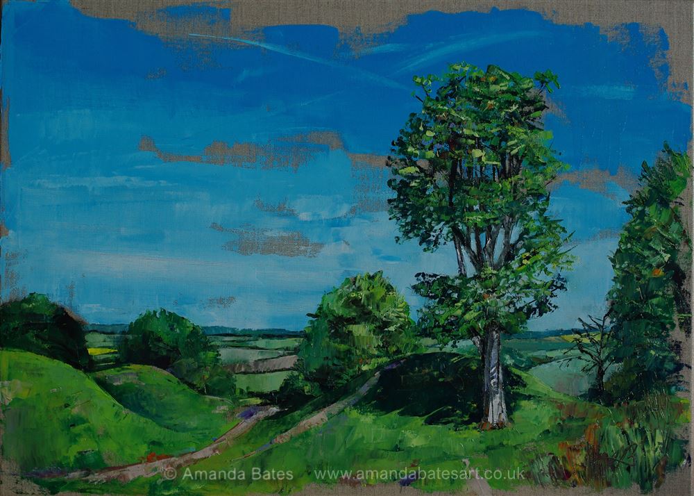
Kimmeridge, which was painted on a clear-gessoed linen canvas with the six tube version of my standard palette: burnt umber, ultramarine, phthalo blue, lemon yellow, rose madder quiacridone. Most of the knife work was done with a Winsor and Newton no.27, with a smaller knife (Langnickel LP-1) used later on. I also used a silicone colour shaper for a few details and my signature.

I'm working from a photograph that I took in 2014. I hadn't seen the possibilities of the shot until now (except maybe in the instant that I took it). I remember the day. It was hot, very hot for England, the heat of the sun bouncing off the rocks. My husband and children were in and out of the sea but I felt unable, uncertain of my physicality, uncomfortable in the heat and unsure of my balance - and besides, I wanted to sketch. I made a very bad, overworked and tiny watercolour of the distant Clavell Tower. And I took lots of photographs.

This was one of them.

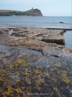
You don't get to see my source photographs very often.

Nearly three years later, I picked it out for the studio treatment. There was a lot of fiddly detail that would challenge the knife; of course, it wouldn't all go in, but if there was any chance of making the Clavell Tower recognisable in any way, I had to use a fairly large canvas. And I was trying not to think about the seaweed, but its colours anchored the image and justified the long format, so I would need to make them work... somehow.

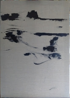
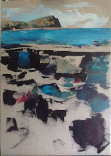
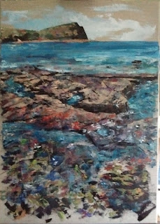
Starting with the darkest areas, pure "dark": burnt umber and ultramaine - marking out the composition. This isn't all of the dark bits, but the position of the horizon and of the central band of rocks seemed, to me, to be important. I placed the top of the rocks quite deliberately at that "magic" 1/3 point that all the theory says is important (or is that "all the theory that I can remember"?) This image didn't need much sky. It was about the sea. And the rocks. Especially the rocks (and the way the sea shaped them).

Well, that's all of my initial darks added, with some colour on top (mainly blue). The lower right is where I imagine I'll be signing it and I try to remember to put a nice contrasty dark there in most paintings. But this isn't most paintings and I completely overlooked the fact that the foreground is all complex seaweed and shadow - too detailed for a swirly AJB right there. But it is quite shadowy in that corner, so that's fine. Hang on a minute - I also forgot to put the sky in!

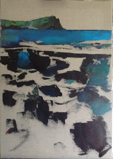
Oh, thank goodness for that. There's the sky. And some pink bits.

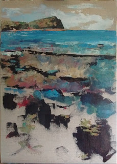
Pink is a surprisingly important colour, Of course, it needs to be a good, strong pink, a blue-red colour - that can be used to tone down the most excessive of your greens, to make lively greys (see the sky), to create purples and oranges and reds. By this stage, I've employed the full paletted and I'm moving around the picture according to where the next bit of the colour on my knife should be. That colour changes as it picks up paint already on the canvas and I'm constantly reassessing, occasionally wiping the blade or, less often, scraping "wrong" paint off the canvas. The rocks are mostly blocked in, aong with the bluest bits of the sea (it's only now that I realise quite how much I have heightened the colour) and I've had a go at some of the seaweed.

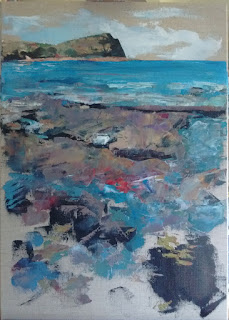
That's most of the canvas covered. I'm leaving bits of the natural linen on purpose. What's the point of a clear gesso if you don't? The rocks are starting to look solid. That red stuff on the closest rock shelf is glorious. I exagerrate it. The seaweed is still a bit ... vague.

I'm ignoring the seaweed. I'm having fun with the rocks. Edge of the knife, incising, finding the hidden dark, or, if that is lost, adding more dark, freshly made on the palette, as it slices through the softly yielding paint already on the canvas. I lose myself in the abstracted detail of the rocks.
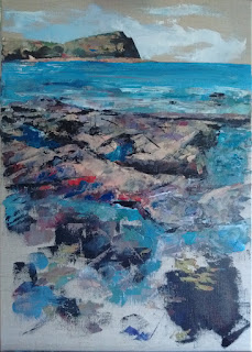
The rocks are working; not quite complete, but I know what's happening there. I've softened the dark shadows on the edges as they curve away from the shadows I've established the main colours, the majority of the cracks and lines. Let's have a go at that seaweed... More shadow. Greenish bits. It's blotchy and crude and it looks alien to the rest of the image.

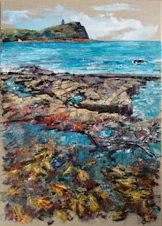
I distract myself with the fiddly details of the tower. It's a distinctive shape, and the appropriate proprtions elude me for a while. The back down to the seaweed... Suddenly, I realise that it's too green. It's a bit green, but there is far more yellow and red - even some white to lighten beyond the powers of the lemon yellow. And the shadows are less blue than I had them originally. The foreground paint layers up, gets scraped back here and there... How do I make it look wet and under-watery? Reflections, ripples, white, nearly white, a few dark, incised with the silicon colour shaper, with the knife (a finer, subtler line, harder to curve). And finally, carefully, dragging a near-white mix gently down over the surface, barely shifting it, distorting a little, smoothing its paleness into the colours already there... Done. Signed. Complete.

Saturday, 20 May 2017

Kimmeridge


Kimmeridge Bay in Purbeck, Dorset is all about the rocks. It lies on the Jurrassic Coast and is a favoured destination for fossil-hunters as well as rock-pool afficianados and snorkellers. It has clear, calm water and a folly on the headland - Clavell Tower, which in 2006-8 was moved away from the crumbling cliff. 

So, of course, my painting is all about the rocks. The flat rocks in the centre dominate the image. I spent most of my time on their colours, curves and cracks, their attendant pools and the wet reflections of the summer sun, but it was the seaweed that worried me most. It was a curious colour - a bright mix of yellow, green, red and orange - and it was underwater, right in the foreground. How could I indicate that with my knife, a blunt painting instrument if ever there was one? In the end, it was all a matter of observation and approximation, as is often the case, and allowing the viewer's visual cortex to fill in the gaps.

Kimmeridge 
Oil on linen canvas, 50 x 70 cm
£400

Monday, 15 May 2017

Arctic Corsair

The Arctic Corsair is the last of Kingston-Upon-Hull's side-winder trawlers, efectively the last remnant of the city's fishing fleet. She currently lies on the mud in the river Hull by the museum quarter and is a museum ship herself. She has been there since 1999 (after the time I lived in Hull) but there is talk of moving her to a dry dock in the near future.

The painting is based on a couple of sketches that I made in January 2016. There is a little artistic licence in a few places - the riverfront warehouse on the right, for example, is a complete fabrication! The jagged red brick edifice in the background, in front of the cream-coloured Shotwell building, on the other hand, was there and was in approximately that shape when I drew the Corsair and her surroundings. It was partially demolished and looked rather like a post-industrial castle.

Arctic Corsair
Oil on canvas, 55 x 46 cm
£200

Friday, 12 May 2017

Restoration Project

Every now and then I decide to alter my palette as a one-off, to use colours I don't use often. It kind of shakes things up a bit as well as usefully delpeting those odd colours that I'm never really going to use often... or maybe make me reconsider the usefulness of some of those colours.

I chose this subject - found in a barn while walking near Chievely in Berkshire - because of its strong shapes. My collection of odd colours inludes a couple of vibrant oranges and orangey earth tones; here, I used Chrome Orange (hue), Pyrrole Orange and Indian Red. I thought they would work well for the different shades of rust. Continuing the odd colours theme, I picked out Phthalo Blue (red shade - I normally use the green shade) and Yellow Green. White is difficult to do without, so I included it, and there was some Rose Madder Quinacridone left on my palette, too, so that ended up in the picture as well.

Restoration Project
Oil on canvas, 40 x 50 cm
£120


Entrance (Chysauster)

I find prehistoric sites entrancing: open to the elements, often in (relatively) remote locations, they are refreshing in their wild freedom yet retain a palpable sense of history. I also rather like painting stones.

This is the entranceway to one of Chysauster's "courtyard" huts. Chysauster, in west Cornwall, is a remarkably well preserved iron age village managed by English Heritage.


My painting was made last week while my studio was open as part of Open Studios West Berkshire and North Hampshire. There's still just over a week of Open Studios left; you'll find my dates and details here.

Entrance (Chysauster)
Oil on canvas, 55 x 46 cm
£190

Bluebell Stump (Wolverton Blue 2) - SOLD

Wednesday's short painting session in Wolverton Wood gave me enough material (on the canvas and in my head) to refine the image in the studio yesterday.

Bluebell Stump (Wolverton Blue 2)
Oil on natural linen canvas, 30 x 40 cm
£120 SOLD

Wednesday, 10 May 2017

Bluebelling

... in progress ...

... and mostly finished.
It was a beautiful day for seeking out and painting bluebells. I took a couple of hours out and visited Wolverton Woods. I will probably do a litte bit more to it tomorrow during my Open Studio...

Sunday, 7 May 2017

Step Over (Chysauster)

Oil on canvas, 40 x 40 cm (03/05/17)
This is the first painting started and completed in my new studio. It was painted while the studio was "open" for Open Studios West Berkshire and North Hampshire.

It's painted from my photograph of the steps over a Cornish Hedge on the approach to Chysauster, an iron age village in Cornwall.